Nothing strikes more fear into the heart of a YA book lover than the announcement of a cover redesign. While a mid-series change can throw your bookshelf aesthetics into disarray, any rebranding can be disappointing. Are YA cover redesigns ever an improvement? Take a look at a recent cover change and tell me what you think:
When a YA cover redesign is announced, you can almost hear the gnashing of collective teeth. I’ve been thinking about this over the past few days and decided that I can think of very few cover redesigns that I approve of.
To me, it seems like most YA cover designs are masterminded by someone who decides that a YA cover (and, probably, all of YA) is much too girly and something must be done.
So pretty, romantic covers get scrapped and replaced by generic, bland covers that tell you nothing about the book.
It’s enough to make you cry.
Recently while scrolling through my social media, I saw an announcement of a redesign of a popular YA series from around 2009. The original covers are gorgeous – among the prettiest YA covers out there – and perfectly fit the books – which take place in turn of the century New York.
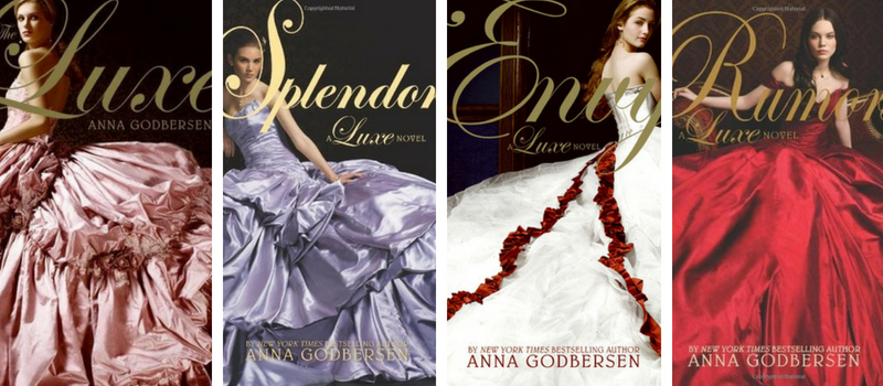
So pretty, right?
I’m not always all about girls-in-dresses covers, but these books featured actual girls in ballgowns who go to balls.
The new covers are below (photo announcing the redesign posted by Epic Reads on Twitter):
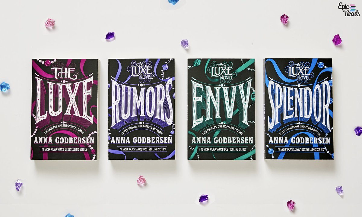
Sadface. Uh, nice typography. But can you look at these and have any idea what the books are about?
We’ve seen this kind of cover redesign before, when romantic covers of gorgeously dressed girls become bland and nondescript.
The book below takes place in Venice, and during the Renaissance, for crying out loud. Can’t we keep the cover of the girl in the mask? The cover on the right looks like a thriller you’d pick up in an airport gift shop.

Here’s another widely cried-over cover redesign that took gorgeous girly covers and turned them into something very different:
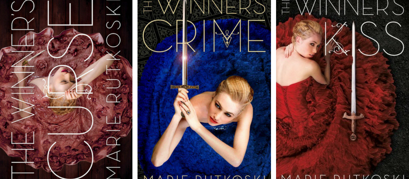
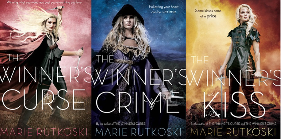
The bottom covers are fine, but (in my opinion) they don’t fit the story nearly as well.
Then there was this very sad state of affairs:

The original cover (far left) was stunning and romantic – as would be fitting for a romantic suspense story set in space. The cover was redesigned twice. The middle cover is yet another generic looking thriller cover and the far right one is … I’m not even sure.
A time I DID approve of a cover redesign:
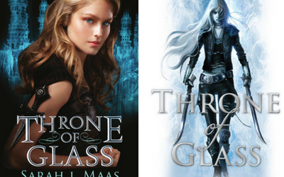
In the original Throne of Glass cover was very pretty, but looked to me like the photograph for the cover of a fashion magazine. I think the redesigned cover better reflects the main character and the story.
ETA: In comments, Jaime of Books and Waffles mentioned a cover redesign she did like. This is an interesting example to me, because it’s a generic cover that is made less generic in the redesign, and I’d say more girly-slash-kick-ass (with the female character with her long flowing hair) and uh… is it me or does this cover a lot like the revamped Throne of Glass covers (above). Maybe it’s an attempt to appeal to fans of ToG? In any case, great example for discussion – thanks Jaime!

My overall take on cover designs: If it ain’t broke, PLEASE don’t fix it. Do these new covers really sell more copies? I’d love to see the evidence of that.
What do you think? Are YA cover redesigns ever an improvement? Please tell me in comments!
Why would they redesign the Across the Universe cover??? I love that one. I think the majority of the time the redesigns don’t work.
That was one I didn’t understand – but I agree with Kimberly that I think they are trying to give the books broader appeal. Which may work, but then again, could also turn off the target audience and the broader audience. Plus, it just pains me to see beautiful covers get scrapped for generic ones.
I wonder if they’re trying to make it less girly so that it’ll appeal to boys more?
I suppose I understand that a TINY bit in the sci-fi space. But the Luxe covers are what they are – historical fiction. And I wonder if it even works….
I was sad to see the redesign for the Luxe series. I LOVE those covers!!!
I agree – I think they are some of the most gorgeous covers in the history of YA covers. WHYYYYYYY?
I usually hate cover redesigns as well, and some of your examples are annoying! I do like how they redesigned the covers for An Ember in the Ashes series. The original covers were a bit bland and boring (a random blurry landscape with absolutely not context) but now they have a cool color scheme and interesting character details that actually go along with the events of the book.
I also didn’t mind the Percy Jackson redesign, but I love the original artwork so much that I’m glad I own copies of those instead.
Ooh, thanks for the counter-example. I hadn’t seen the new Ember in the Ashes covers. I’m incorporating this into my post because it seems that the new covers are more girly (though kick-ass girly) and less generic and more like the Throne of Glass covers lol.
Thank you for including my idea! That’s so nice of you. And now that I see it next to the Throne of Glass series, I can definitely see the similarities. I also know the author mentioned part of the reason for the cover change was to give a POC character (Laia) a spotlight on the cover. As someone who normally doesn’t like faces on her covers, I’m glad for this change because it’s needed in the book community!
I didn’t know the reason (a good one) but I agree that it’s a much better cover!
I’m friendly with a few authors who have (been victims of) had cover redesigns and it strikes fear in them as well.
But it gave insight as to why the pubs (say) they do this.
The series is usually under performing and they hope that a fresh cover will help gain new attention.
The series might be doing well but they think they can bring in new readers (like boys for a dystopian series for example – that they think are alienated by the *girly* cover)
The series has performed better than expected and they might be willing to put in a bigger budget for covers now than they had when it first came out.
I would LOVE to know if this ever works because, as you said, the covers are almost always worse and alienate the fans you do have.
I’m fine with new pb rebranding but never change the hc’s in the middle of a series.
Karen @ For What It’s Worth
Yes, that is a good rule: change the paperback cover if you want to experiment.
As for the “girly” factor, I certainly do not think that every YA cover needed a girl in a dress (as seemed to be happening 8-10 years back.) But why can’t books about girls in ballgowns have dresses on the cover?
I do think that making a cover appeal to the most people could mean that it will actually appeal to no one… but just a theory. Maybe a publisher should do an experiment and release two completely different covers at the same time and see which one has the most sales.
I agree. I *kind of * get the reasoning in some cases but does it work??? Do they have stats that show an increase in sales with the new covers?
I always wonder because we bitch about so many things but would they go through this blow back and the expense if it didn’t make money?
The Luxe redesign is tragic. I think the girl on the cover was more true to the series. I dont mind the Ember in the Ashes redesign because I never really understood what was on the cover.
I DO like the His Fair Assassin redesign though!
I also like the Ember redesign, though it seems very similar to the ToG covers.
I don’t hate the new His Fair Assassin covers, but I don’t love them. I feel like they could have a little more menace…..
I think 90% of the time I hate redesigns. Great examples! I kind of like the Luxe covers, but NOT as replacements for the originals. I mean you’re right, the first ones have a person and beautiful dresses on them, and the new ones- ???
Also the Rutkowski covers especially- why even? The first ones were so much better. And oh my gosh same with Venom.
I think I agree about Ember in the Ashes- I MIGHT like the newer cover better on that one…and I kinda like all three across the Universe covers, oddly enough, in different ways, although I do think the first one is more romantic and therefore probably fits the story better.
I think I’m with you on the 90%. I do like the new Ember cover better. I am NOT a fan of the two new Across the Universe covers – to me, the first cover just perfectly captured the idea of a romance in a spaceship. And haha not surprised you liked the third Across the Universe cover – it looks like it could be a poster for a B movie and I know you love to review those lolol
i am going to agree with all your assessments fully. I hate the new covers for luxe series. I so loved the originals. They were perfect.
Recently I did see the harry potter series redone in black and white with a pop of color. I have never really liked any of the covers for harry potter until these. I just love the feel of them. Great topic to discuss. think most of the time cover redesigns suck but then there were some much needed and well done ones out there. I wish they wouldn’t do it so much though. makes me want to go out and rebuy them all…. of course isn’t this the reason they do it. lol
I also prefer the new Harry Potter covers, though none of those covers are my absolute favorite. Yeah I wonder how many people do rebuy, since most of us seem to like the old covers better?